
For about a year now I’ve worried about whether our head-to-head format exaggerated the volatility of our standings as compared to reality.
(WARNING: This post is about math. It doesn’t make you DO any math. But it has charts and stuff in it, and talks about things like quadratic equations and exponential results. So if you don’t care to see how the sausage gets made, you can skip this post. )
(On the other hand, it might be fun to watch a lawyer try to explain math he barely understands (or maybe doesn’t quite understand) to an audience including an Oracle-trained Oracle, a Wizard, and a real-life Mathematician.). (And another lawyer!)
These were the standings as of the end of Week 19:
| Season Standings W 19 | W | L | Pct | GB |
| DC Balk | 73 | 41 | .641 | .0 |
| Old Detroit Wolverines | 73 | 41 | .636 | .6 |
| Salem Seraphim | 72 | 42 | .631 | 1.2 |
| Canberra Kangaroos | 72 | 42 | .628 | 1.6 |
Week 20:
| Season Standings W 20 | W | L | Pct | GB |
| Salem Seraphim | 77 | 43 | .642 | .0 |
| DC Balk | 77 | 43 | .639 | .3 |
| Old Detroit Wolverines | 76 | 44 | .632 | 1.2 |
| Canberra Kangaroos | 76 | 44 | .631 | 1.3 |
Week 21:
| Season Standings W 21 | W | L | Pct | GB |
| Salem Seraphim | 82 | 44 | .652 | .0 |
| Old Detroit Wolverines | 81 | 45 | .641 | 1.3 |
| DC Balk | 78 | 48 | .619 | 4.2 |
| Canberra Kangaroos | 78 | 48 | .617 | 4.4 |
Week 22:
| Season Standings W 22 | W | L | Pct | GB |
| Salem Seraphim | 87 | 45 | .657 | .0 |
| Old Detroit Wolverines | 83 | 49 | .627 | 4.0 |
| Canberra Kangaroos | 83 | 49 | .626 | 4.1 |
| DC Balk | 81 | 51 | .614 | 5.7 |
Week 23:
| Season Standings W 23 | W | L | Pct | GB |
| Salem Seraphim | 92 | 46 | .664 | .0 |
| Old Detroit Wolverines | 87 | 51 | .634 | 4.2 |
| DC Balk | 86 | 52 | .627 | 5.1 |
| Canberra Kangaroos | 86 | 52 | .620 | 6.1 |
… at which point I thought it was all over. The Seraphim had finally broken away, as I had expected most of the summer, and now that we were in September, no one was going to catch them.
Week 24:
| Season Standings W 24 | W | L | Pct | GB |
| Salem Seraphim | 95 | 49 | .660 | .0 |
| Old Detroit Wolverines | 93 | 51 | .642 | 2.4 |
| DC Balk | 92 | 52 | .641 | 2.6 |
| Canberra Kangaroos | 87 | 57 | .604 | 8.0 |
This was the week the Kangaroos ran into the Pirate buzzsaw. The non-EFL Pittsburgh team outscored its opponents 39 – 21, while Canberra scored one more run than it allowed. The combination left the ‘Roos 1.4 – 4.6 on the week, and effectively out of the race…
Week 25:
| Season Standings W 25 | W | L | Pct | GB |
| Salem Seraphim | 96 | 54 | .642 | .0 |
| DC Balk | 96 | 54 | .637 | .8 |
| Old Detroit Wolverines | 95 | 55 | .636 | 1.0 |
| Canberra Kangaroos | 92 | 58 | .610 | 4.7 |
… or maybe not! The ‘Roos eliminated almost half their deficit in one week, with two weeks to go, while the Balk and the W’s closed in on the supposedly locked in Seraphim, who were the victims of Canberra’ .909 raw winning percentage that week.
Week 26:
| Old Detroit Wolverines | 100 | 56 | .641 | .0 |
| DC Balk | 99 | 57 | .635 | .9 |
| Salem Seraphim | 98 | 58 | .626 | 2.2 |
| Canberra Kangaroos | 94 | 62 | .603 | 5.8 |
Like son, like father: the Wolverines put another hurt on the Seraphim, dumping them into third place! A 3.2 game swing in only 6 games played. Meanwhile the ‘Roos and the Balk knocked each other out.
Week 27:
| Season Standings W 27 | W | L | Pct | GB |
| Old Detroit Wolverines | 105 | 57 | .651 | .0 |
| DC Balk | 102 | 60 | .630 | 3.4 |
| Salem Seraphim | 101 | 61 | .621 | 4.9 |
| Canberra Kangaroos | 95 | 67 | .584 | 11.0 |
Wolverine pitchers allowed only 6.5 runs all week, while their hitters scored 28.8, resulting in a .951 raw winning percentage. The ‘Roos cut it to .927 by playing well, but it was still a 5.6 – 0.4 week for the W’s. Meanwhile the Balk and the Seraphim knocked each other out.
That was an exciting 8 weeks with a dramatic (and less-convincing-than-it-looks) conclusion, in which three different teams were in first place, and the Balk went from 1st to 4th and then ended two straight weeks in second place less than a game behind two different first place teams. And the Kangaroos hopped all over the place, trailing by as little as 1.3 games and as much as 11.0.
But was it realistic? Or was it the artifact of piling two quadratic equations on top of each other, generating some kind of super-exponential effect?
Sometimes things change in a straight line, each new increment of something changing something else by a certain amount, no matter how many times you do it. If you put a dollar into your bank account, your bank account goes up a dollar. Like this (ignore the units along each axis):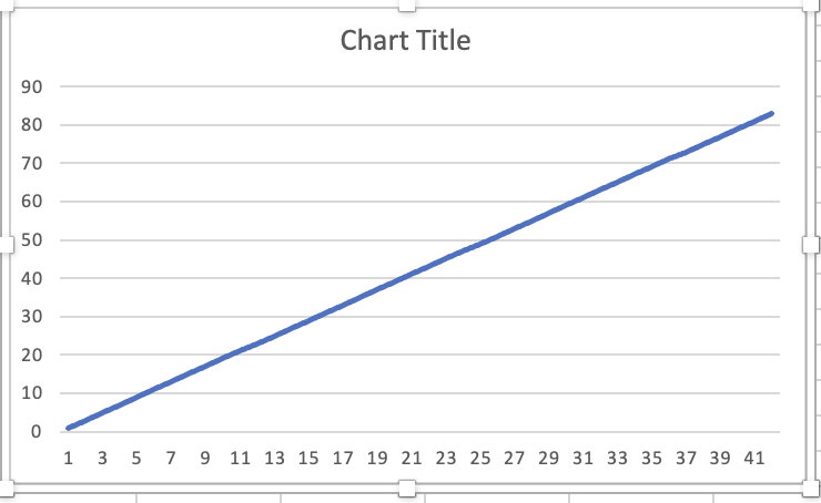
But some variable interact in non-straight lines. For example, if you imagine two baseball teams playing each other over and over for all eternity. Let’s say these two teams each average 10.5 runs a game (obviously this is after banning the shift and increasing the size of the bases). You could use Bill James’ pythagorean formula to predict the odds of winning a game with 1 run, or 2 runs, or 3 runs, and so forth, and then chart those odds. They would look like this:
FIG. 1 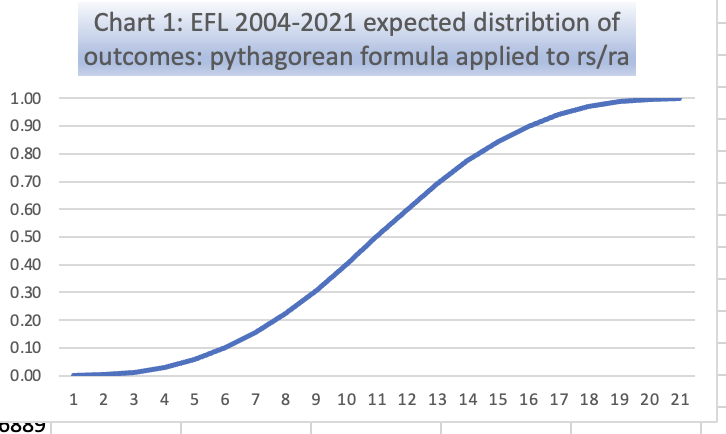
Note that it is impossible to win with 0 runs, and impossible to lose with 21. It is not quite impossible to win with 1 run, or lose with 20 — it’s just that winning while scoring 1 run in a league where teams average 10.5 runs per game is exceedingly rare.
The average result is the same as a straight line function. But improving from 1 run to 2 runs in a game doesn’t move the needle much on escaping a loss. And dropping from 20 runs to 19 isn’t likely to cause you to lose. This stickiness at each end means there are more possible outcomes that can rocket a team forward or drag them under. This would make for more volatility in the standings.
We get curvilinear functions like this when the equations describing them have things squared (or cubed, etc.). But last season we took a squared function applied to rs v. ra, and squared it again by treating one team’s pythagorean-predicted winning percentage as runs, and its opponent’s pythagorean-predicted winning percentage as runs against.
Here is what would happen to our hypothetical 10.5-run scoring teams if they switched to head-to-head competitions based on expected winning percentages instead of rs/ra:
FIG. 2
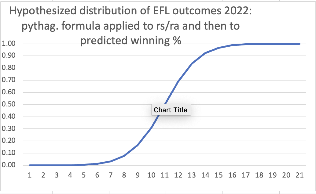
Yikes! More than half of the possible outcomes are either nearly certain wins or nearly certain losses. With all those chances to be doomed to lose or win, it would be pretty easy to string together winning or losing streaks. Teams should be bouncing all over the standings!
So I did some clever cutting and pasting, and sorting, and listed every EFL team’s weekly raw predicted winning percentage from last year in a long column — 297 items in the column. These ranged from .974 (for DC in Week 24 against the Tornados) to .110 (for the Pears in week 19 against the Seraphim). Here is how the whole list’s distribution looks:
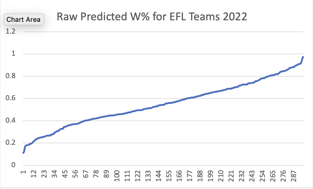
This surprised me. That’s almost a straight line function. There’s a little bend in the data, but what curve there is goes the wrong way.
Something similar happens when you look at the predicted winning percentages of our opponents in 2022:
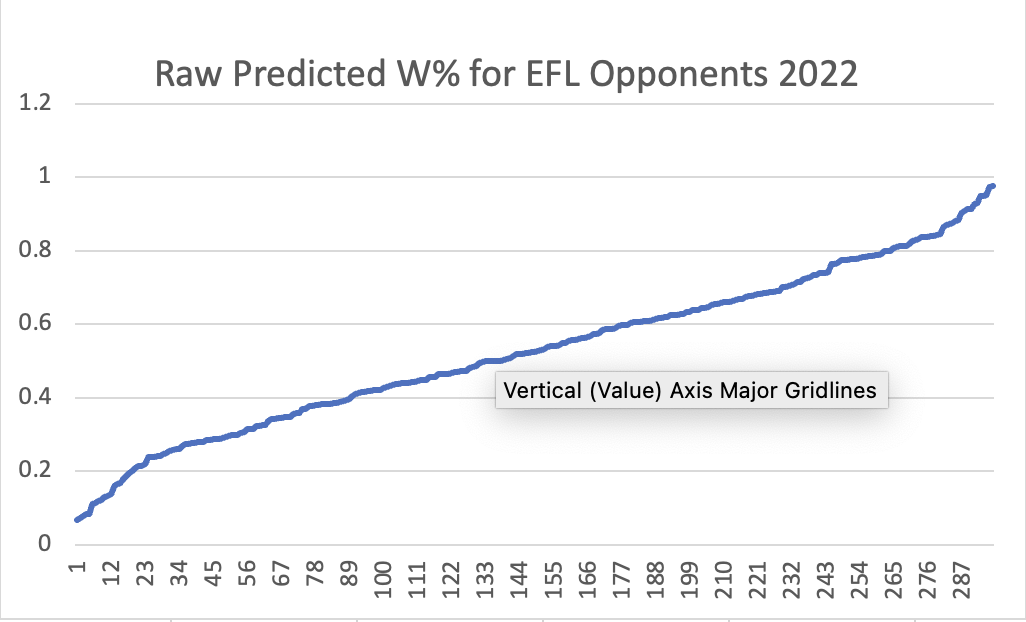
Almost identical.
The very best week of the season was produced by an MLB team: the Padres in Week 10, facing the Rosebuds, scored 38 runs and allowed only 6 for a raw predicted winning percentage of .977. On the other hand, the five worst weeks were also MLB teams: the Detroit Tigers facing the Tornados in Week 11 had the worst raw predicted winning percentage of the year: 0.068.
Maybe compounding the quadratic equations would finally produce a clear and dramatic exponential function. Here is what our data shows:
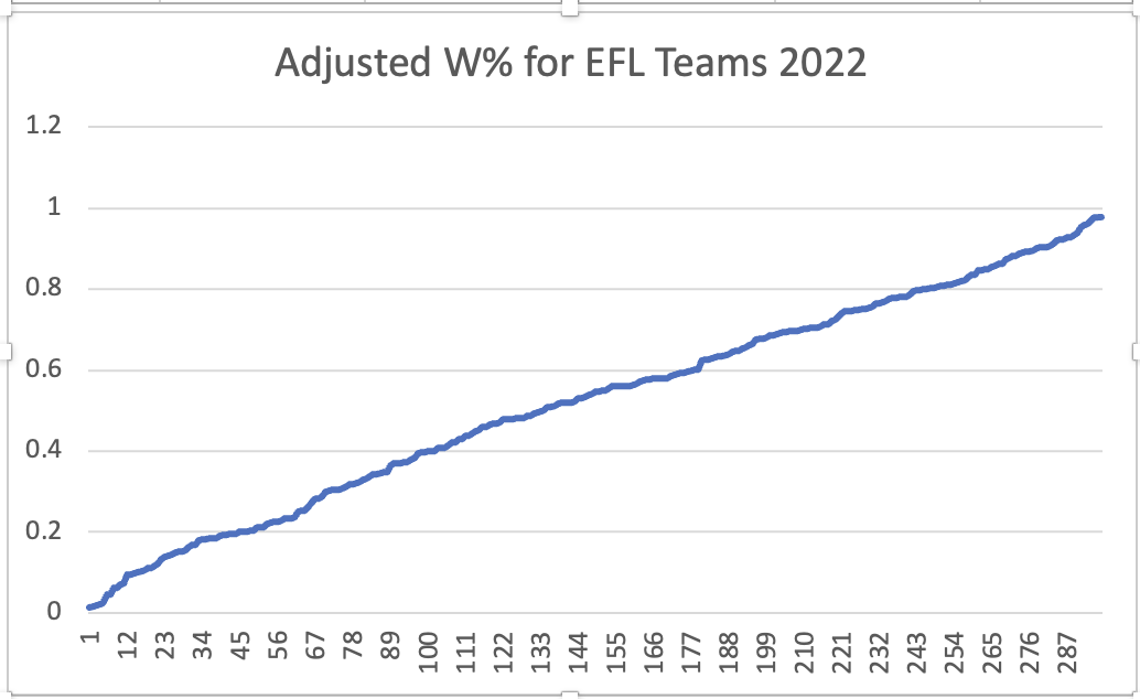
The maximum and minimum results are both more extreme — .979 and 0.014. But it’s still almost a straight line.
Why is this? Why do the hypothetical curves in Figures 1 and 2 — so dramatic, smooth and beautiful — turn into these boring frumpy nearly-straight lines? I suspect it’s because, in real life, the outcomes at the extremes of the chart are far less probable (and thus far less numerous) than the outcomes in the middle. Fig 1 and Fig 2 show what the curves would look like if all the outcomes were of equal probability — if teams scored 20 runs as much as they scored (the unrealistic hypothetical) average of 10 or 11 runs. But teams in a league averaging 10 runs per team per game do not score 20 (or 0) runs as often as they score 10 runs. So while teams pile up wins (or losses) faster when the outcomes are close to the extremes, they have fewer such outcomes.
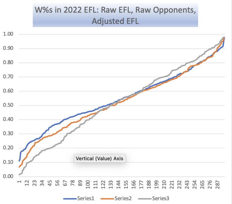
Here are the three previous charts altogether, with the vertical scale stretched out a bit to magnify the curvature of the lines a little:

The doubly-exponential function of Adjusted Expected Winning Percentage does diverge a bit from its contributing functions. The line is straighter — more linear — not because the extreme results were dampened (they were a tiny bit more extreme) but because we spent slightly less time generating near-.500 results.
I notice the doubly-exponential results varied from the merely-exponential more on the losing side of things. I suppose this means more of us got unlucky in our matchups than lucky.
It looks like my fear that we’d gone too far to generate vivid results was unfounded. We got a little more volatility in our outcomes, which to my thinking is good, but it wasn’t to a crazy degree.
This season, we will spend 7 weeks facing exactly .500-level performing generic MLB competition, which should dampen standings volatility a bit. But we’ll face each other for the 20 weeks — twice as much as last season — which I think might enhance volatility in our standings.